In the several hours I’ve played since Starfield’s September 1 Early Access kicked off, I’ve been consistently confused by the menus and user interfaces of Bethesda’s latest RPG. I remain miffed by its starmap, baffled by its inventory, and at a loss when it comes to my ship’s HUD–and don’t even get me started on the shipbuilder, which almost sent me into a tailspin.
Bethesda games are infamous for their clunky UI. Modders have spent hours upon hours overhauling in-game menus so that they’re more intuitive and easier to navigate. But at least in games like The Elder Scroll V: Skryim, the initial menu is minimalist and straightforward–bring it up with a button press and then select from one of four clearly delineated options (skills, magic, items, and map), then navigate to a more involved menu that breaks down your inventory by type, or sweeps up to show your skill tree in the form of constellations.
Read More: Starfield Chat: Our First Few Hours With Bethesda’s Space Epic
Buy Starfield: Amazon | Best Buy | GameStop
Starfield technically follows that design logic, but its NASA-punk stylings and heaps more content make for a navigational nightmare–especially for someone as impatient and clunky as myself.
Lost in Starfield’s menus
In Starfield, the first thing that pops up when you press the menu button on your Xbox controller is an iteration of Bethesda’s prototypical menu setup, but it’s got so much visual noise that it immediately overwhelms. (It’s important to note that you have to hard press the menu button to get to your basic start screen that includes options to quicksave, load, and change your controller settings, which can be confusing.)
On this screen, there’s a circle and four quadrants. In the center of a circle stands your character in whatever getup you’ve got them in at the moment; their name, level, and health displayed next to them. At the bottom of that circle is the mission you’re currently on/following, but it’s not labeled as such, all you can see is its name and next steps. If you select this, you’ll be taken to all the possible main quests, side quests, and “activities” available to you.
Read More: Where To Sell All The Stuff You Grabbed In Starfield
The top-left quadrant outside of that central circle shows your current location, local time, and survey data–selecting this section brings you to the starmap, which we’ll get into later. The top-right quadrant shows one of your skills and how far along you are in that skill’s certification progress–completing that will let you use skill points to advance its level. Selecting this section takes you to your skill tree, one of the more legible parts of Starfield’s menus with five clearly labeled skill sections (physical, social, combat, science, and tech) that are then mucked up by dozens of tiny icons representing each possible selection.
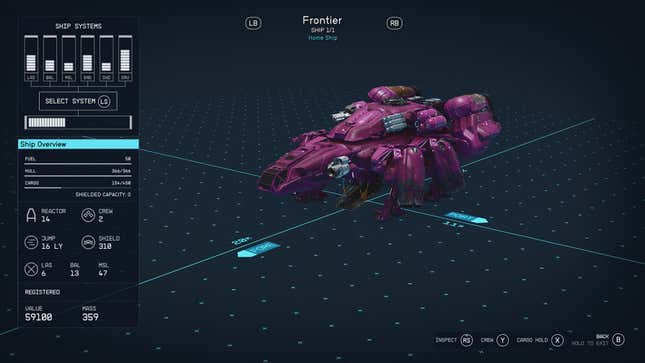
The bottom-left quadrant shows your ship’s information–what class it is, how many crew are on it, the hull’s strength, etc. Selecting that brings you to a truncated version of the nightmarishly complicated ship builder (you can only customize your vessel while docked at certain shipyards), that shows your ship floating on a sort of digital blueprint with measurements displayed along it.
A crowded display on the left-hand side shows the levels of all six of your ship’s systems (I still don’t know what each abbreviation stands for). Here, you can navigate between each of the ship’s systems, and get a half-dozen data points for each one: from how much “power” your 10S Protector Shield Generator has to the hull damage your Atlatl 270Z Missile Launcher can cause. There are so many numbers and graphs that it triggers the same fight-or-flight response I used to get in high school math class.
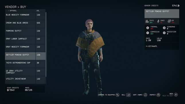
The bottom-right quadrant of Starfield’s main in-game menu shows your current weapon and its mass, and selecting it opens up your inventory. There’s no way to quickly swap between weapons during firefights (pressing down on the D-pad lets you access medicine and there appears to be a quick-select wheel here, but I can’t figure out how to assign anything else to this section), so you must return to this inventory menu when you inevitably run out of bullets for your Eon or Grendel.
Read More: Starfield Players Are Already Filling Up Their Ships With Random Junk
Frustratingly, though I can easily see what kind of ammo I have in my inventory menu, I can’t tell what fucking ammo goes for what fucking gun, so I’m almost always unsure what weapon to quickly swap to during combat. Hovering over each gun in your inventory brings up–you guessed it–more information, from fire rate to range to accuracy to mods, and rounds, which is tucked away in the top right corner, one of nine different data points.
The lack of a difference in font size or color between the item you have equipped and the item categories can be a little confusing: “Deep Mining Space Helmet Helmets” becomes an oft-repeated refrain as I play. But I run up against the most friction in the starmap menu because it combines Starfield’s crowded UI with my Aries lack of patience, making for a potent cocktail of confusion.
Starwoman, waiting in the sky
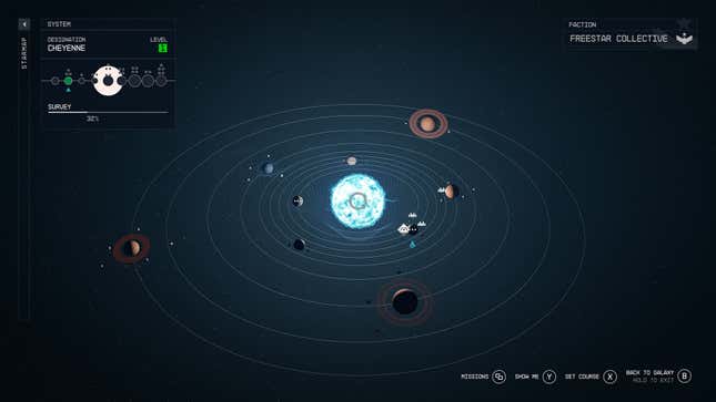
After selecting the starmap from the aforementioned top-left quadrant, you’ll see a view of the planet or space station you’re currently on, with details about the planet on the left side, an option to scan below that, and several button prompts in the bottom right corner: missions, show me, set landing target, and back to system.
Pressing B will zoom you out to a full view of the solar system that houses that planet or space station and all the icons indicating explorable places within that solar system. Press B again and you’ll zoom out to the galaxy–but you have to hold B in order to exit this map screen, a maneuver that isn’t very intuitive and often results in me rapidly zooming in and out of solar systems and galaxies like I just dropped acid.
And the other options, “show me” and “set course” are not very straightforward. What the fuck does “show me” mean? Are you “showing me” where I need to go on this massive (and hard-to-read) map? Sometimes “show me” will snap-cut to a shot of a planet I know I haven’t seen before, but it’s not immediately clear how I’m meant to get there–at least not for me, and as I play Starfield I feel increasingly like my years of marijuana use have finally started doing what my parents always warned me about: making me stupid.
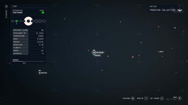
After I play the opening act and am unceremoniously made the captain of my own spaceship, I spend several minutes cursing under my breath and angrily clacking the Xbox controller’s joysticks around while trying to figure out how to fly to Starfield’s major city, New Atlantis. My partner, normally a patient backseat gamer and apparently a native Bethesda menu speaker, finally snaps after a few minutes of me flying my ship, snail-like, towards another system. “This is intuitive, hover over the spot you want to go, select A, hold X to travel. You aren’t even trying to figure this out,” he says, laughing in disbelief.
He’s not wrong, but also, there’s a lot going on in every corner of my screen, and I’m easily confused! After his somewhat stern advice, it takes me several more trips into space to figure out how to easily select a mission location from the mission menu and view it on my map, and then fast-travel to that point on the map. I’m now at a point where I can get where I need to go, with several ham-handed maneuvers and “oopsies” along the way, but it shouldn’t be this difficult, Starfield. I know flying a spaceship and managing resources and conserving ammo and lightspeed jumping between galaxies and eating space cereal and upgrading weapons and negotiating hostage situations requires a lot of concentration, but I feel like I need a PhD to play this game efficiently.
Buy Starfield: Amazon | Best Buy | GameStop
How do you feel about Starfield’s menus so far?
