The Legend of Zelda games have had around 13 distinct art styles across its main series.
With the announcement of a Link’s Awakening remake for Switch, Nintendo is trying out yet another new art style of The Legend of Zelda series. This is far from the first time it’s done something different, so we decided to take a look back at every unique visual style Zelda has used over the years.
While Nintendo’s other flagship franchise, the Super Mario series, has generally stayed fairly consistent with how its mustachioed plumber looked over the years (at least since it made the jump from 2D to 3D), the Zelda series has always been much more experimental.
You can flip through the slideshow above for loads more images and examples than we were able to fit on this page!
For this list, we’ve lumped together games that we think share an overall style or intent even if they look a little different, potentially due to a difference in platforms. As a result, we’ve narrowed down 13 distinct art styles across every main series Zelda game, not including spin-offs like Hyrule Warriors or the cursed Zelda CD-i games.
The Legend of Zelda

Released: 1986
This is a bit unfair since it’s the very first Zelda game, but the NES original has a style that established the blueprint for what the Zelda series would be, but its actual look was quickly changed as technology outgrew it. Thanks to the limited hardware, Zelda began its life as a fairly flat, top-down game with simple characters and environments, but it was still brimming with personality.
It laid the groundwork for most of the 2D Zelda’s after it, especially in regards to its perspective, which angled characters and objects away from the camera almost like you are viewing them from the side, but angled every wall away from the center of the screen so that your view is never blocked by them on the bottom edge.
Later Zeldas do the same thing, but the original stands as the only one to use its fairly simple look outside of a tech demo that was made for Breath of the Wild.
Zelda 2: The Adventure of Link

Released: 1987
Just because Zelda’s style changed fast, doesn’t mean it changed for the better. Before A Link to the Past arrived in 1991 and established an art style that so many games after it would use, Zelda 2 played around with a side-scrolling aesthetic more akin to Castlevania or Mario. It used similar level styles and color schemes, but it’s otherwise an outlier in the Zelda series as a whole and did very little to inspire the art of later games.
A Link to The Past/Link’s Awakening/Oracle of Ages/Oracle of Seasons/Four Swords

First Game: A Link to the Past, 1991
A Link to the Past set the bar for years of Zelda games to come. Though the Game Boy couldn’t hit the same level of graphical fidelity as the SNES, Link’s Awakening used Link to the Past’s style right after it, and both Oracle of Ages and Oracle of Seasons followed its lead nearly a decade later on Game Boy Color (with a splash of extra color here and there, given the new system).
Link to the Past’s art is the retro style most commonly associated with 2D Zelda games, and one that was briefly resurrected again for the original Four Swords when A Link to the Past was re-released on Game Boy Advance. It was largely iterated on and changed after that point, but you can still see its influence everywhere.
Ocarina of Time/Majora’s Mask

First Game: Ocarina of Time, 1998
The jump to 3D was a big one for the Zelda series, but the art style debuted in Ocarina of Time (and then reused with a slightly darker mood in Majora’s Mask) didn’t actually stick around for too long. It shares a similar role to the very first Zelda, laying the groundwork before 3D technology improved past it.
It did, however, establish a lot of characters and creatures that would come and go (and drastically evolve throughout the series like the Gorons, Deku, and Zora. Ocarina and Majora are an iconic-looking pair of games and set the tone for future Zelda titles despite them having drastically different takes.
The Wind Waker/Phantom Hourglass/Spirit Tracks

First Game: The Wind Waker, 2002
The Wind Waker’s cel-shaded, hyper cartoony graphics were divisive at the time it came out, but this game has arguably had one of the largest impacts on the art of future Zelda games as a whole, even as the series went back toward a more realistic take.
Despite the initial backlash, Nintendo actually returned to this look after Twilight Princess for both the Phantom Hourglass and Spirit Tracks DS games, and its cartoon poofs of smoke and fire have shown up far beyond that. The cartoon link face is also reused in countless games and promotional materials, and it’s not hard to draw a line from the Wind Waker style to Breath of the Wild’s lighter tone and cel-shading as well.
More than that, it was also the first time Zelda games really started experimenting with art styles in a meaningful way. A lot of the changes before this point could easily be chalked up to changing technology, but Wind Waker is where Nintendo consciously decided to go in a different direction, and they’ve been more willing to continue to do so ever since.
Four Swords Adventure

Released: 2004
Just after Wind Waker, the GameCube spin-off of the GBA Four Swords mode was the first 2D Zelda game to start drifting away from Link to the Past’s look. It undoubtedly looks the same in a lot of ways, even recreating exact assets from the SNES era, but it did so with the clear and present influence of Wind Waker throughout.
The slightly brighter colors were more in line with Wind Waker, and particles like smoke and fire looked like they were pulled straight from that game. It even included enemies from Wind Waker, and the multi-colored Links on the promotional art used its iconic cartoon eyes instead of the previous art styles.
As a result, Four Swords Adventure stands alone as a strange hybrid of two different Zelda art styles and is the only game to so clearly mix in others in that way.
The Minish Cap

Released: 2004
The same year that Four Swords Adventure mixed together Wind Waker and Link to the Past aesthetics, The Minish Cap came out on Game Boy Advance and gave a glimpse of how future Zelda games could really stretch their wings. It was a 2D Zelda that didn’t just borrow from previous entries, but instead took inspiration from them and evolved their styles.
It’s easy to compare Minish Cap to Link to the Past, but its art style is actually very unique in the world of Zelda. The promotional art was still using the Wind Waker cartoony vibe, but the in-game sprites aren’t really like anything else.
Colors lean more toward pastels and bright but simple shades, and things like trees and character designs started getting a lot more detail in them. It’s recognizably Minish Cap, and stands out from other Zeldas as a result.
Twilight Princess

Released: 2006
Ah, Zelda’s emo phase. The negative reaction to Wind Waker’s bright and cheerful cartoon look was so strong that Nintendo pulled the E-brake and flipped a 180 hard toward the other direction. The reaction to the much darker tone Twilight Princess introduced, ironically, wasn’t entirely positive either.
Twilight Princess went for as much realism as it could for a game released on both GameCube and Wii. Nintendo didn’t stick with the grittiness long as public opinion started shifting on Wind Waker’s look, but Twilight Princess still established what a 3D Zelda game would generally look like going forward.
Skyward Sword

Released: 2011
Between Twilight Princess and Skyward Sword were Phantom Hourglass and Spirit Tracks, which used Wind Waker’s style almost exactly as I said before. So Nintendo went cartoony and people got mad, then it went dark and people got mad, and then went cartoony again and people liked it, so with Skyward Sword Nintendo mixed a bit of the Wind Waker brightness back into the Twilight Princess 3D skeleton.
On a 3D model and detail level, the two games don’t look too far apart. Link’s face and demeanor are extremely similar in Skyward Sword, but the color saturation has been cranked up to 11. It completely abandoned the dark and dreary Twilight Princess look in favor of a bright world above the clouds.
Skyward Sword even started to bring back some of the exaggerated character designs of Wind Waker with people like Goose, though it didn’t ever go full-on into the cel-shading or cartoon art styles. It ultimately laid the groundwork for Breath of the Wild as well, though we wouldn’t know it for a while.
A Link Between Worlds

Released: 2013
After borrowing Wind Waker’s style for a couple of 2D Zeldas, A Link Between Worlds saw Nintendo blazing a new trail. While its art style is certainly comparable and inspired by A Link to the Past (a game it’s tied to in more ways than one), it manages to be a modern evolution of that look rather than a modern remake.
Despite sharing some of the Wind Waker sensibilities, Link Between Worlds’ character designs are extremely unique within the series. This Link doesn’t really look like any specific Link before him, both in 3D and when he’s plastered to the wall as a painting – though the latter is undoubtedly influenced by the drawings established in Wind Waker.
A Link Between Worlds didn’t just make Link to the Past 3D, it really added its own spin altogether. It took notes from the cartoony and bright styles of Wind Waker and Skyward Sword, but it proved Nintendo is still willing to fundamentally change the look of the Zelda series in a way that it isn’t with Mario.
Tri Force Heroes

Released: 2015
I’m not gonna lie, the art style of Tri Force heroes feels like kind of a hodgepodge mess when stacked up against the rest of this list. Similar to Four Swords Adventures, it mixed and matched pieces from other games rather than doing anything totally new.
Its colored Links have the faces from Wind Waker but almost borrow the bodies of Nintendo’s Miis with strange customizable outfits. The world itself is a weird 3D style that looks like neither Link Between World nor Link to the Past, but also doesn’t really follow the lead of the more traditional 3D Zelda games.
It’s hard to say that Tri Force Heroes really came up with a new style of its own, but it’s also not really comparable to any other Zelda game, leaving it in a bit of an awkward (and thankfully short lived) limbo.
Breath of the Wild

Released: 2017
Breath of the Wild changed Zelda in a whole lot of ways, to the point where its new art style may actually be one of the less remarkable things about it. While the last two 3D Zeldas (Skyward Sword and Twilight Princess) shared similar styles with wildly different art directions, Breath of the Wild started to make larger tweaks to Link’s look – and I’m not just talking about his fancy new clothes.
It clearly followed the lead of Skyward Sword with its vibrant colors, but it also started leaning back into Wind Waker’s cel-shading and cartoonish vibe, though obviously not to the same degree.
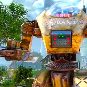
Breath of the Wild also took the bright blue elements that Skyward Sword had introduced and made them a core part of the game. It drifted away from the traditionally ‘fantasy with a Zelda twist’ setting in favor of robotic constructs and what is basically an iPad on Link’s hip. It’s unclear how much of this will carry into future Zelda games, but Breath of the Wild changed a lot of whatever 3D Zelda “style guide” there was to seriously differentiate itself.
Link’s Awakening (Switch Remake)
Releasing: 2019
Bringing us into the present, the newly announced remake of Link’s Awakening is also moving away from the original’s Link to the Past inspired style and into something we’ve (again) never really seen before. The almost plasticine look and beady eyes of its characters is totally different than both A Link Between Worlds and the Wind Waker look that many previous 2D Zeldas draw from.
Functionally, it appears to be a similar visual setup to Link Between Worlds, but it’s certainly not the same style. It even appears to be using a tilt-shift blur effect in some areas, though we’ll have to wait to get our hands on it to get a good look. It’s a wonderful example of how Zelda is willing to constantly change.
Which Zelda art style is your favorite, and what do you think of the new one for Link’s Awakening? Let us know in the comments below!
Tom Marks is IGN’s PC Editor and pie maker. You can follow him on Twitter.


